Creating and configuring a homepage involves adding various content sections to achieve a customized and engaging layout. Please go to Dashboard > Website Settings > Website Builder. Below is a detailed guide on the different content sections you can add and their available layout designs.
Hero: #
The Hero section is typically the first thing users see when they visit the homepage. It often showcases high-impact images and introductory text. The Hero section has two settings: Content and Style.
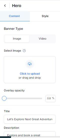
Content Settings #
- Banner Type: Choose between an image or video for the hero banner.
- Image
- Select Image: Upload or select an image to display in the hero section.
- Overlay opacity: Adjust the opacity of the overlay to ensure the text is readable against the image.
- Video
- Video iframe: Insert the iframe link of the video to be displayed in the hero section.
- Title: Enter the main heading for the hero section.
- Description: Provide a brief description or tagline to complement the title.
- Button label: Set the text for the call-to-action button.
- Button URL: Provide the URL where the button should direct users.
- Show Tour Search: Toggle this option to enable or disable the tour search functionality within the hero section.
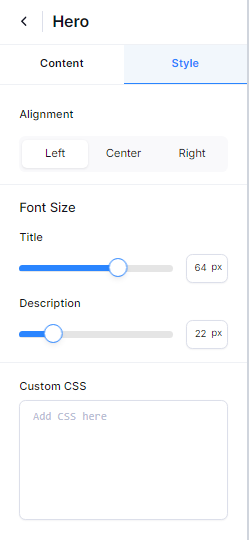
Style Settings #
The style settings for the Hero section include the following options:
- Alignment : Align content to left, center, or right.
- Title: Adjust the font size of the title.
- Description: Adjust the font size of the description.
- Custom CSS: Add custom CSS to further style the Hero section as per your requirements.
Tour Packages: #
The Tour Packages section highlights different travel packages available on your site. This section allows you to showcase various tour packages to attract potential travelers. The Tour Packages section has two main settings: Content and Style.
Content Settings: #
The content settings for the Tour Packages section include the following options:
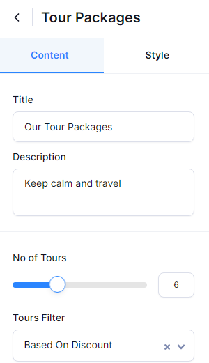
- Title: Set a prominent title for the Tour Packages section that captures attention and conveys the section’s purpose, such as “Explore Our Top Tours.“
- Description: Briefly describe what visitors can expect from the tour packages. This could include details about the types of tours available, their unique features, or any other relevant information.
- No of Tours: Specify how many tour packages you want to display in this section. This number determines the number of packages that will be showcased on the homepage.
- Tours Filters: There are two filters available. Enable to show filters based on available discounts. This allows visitors to easily find tours that are currently on sale or offer special deals. You can also select the specific tours you want to feature in this section. You can choose from existing tours in your system or add new ones.
- Button label: Set the text for the button that users will click to view more details or take action related to the tour packages, such as “View All Tours.”
- Button URL: Provide the URL to which users will be directed when they click the button. This could link to a page with more information about the tours or a booking page.
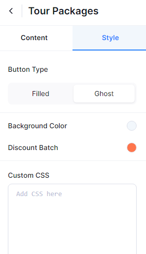
Style Settings: #
The style settings for the Tour Packages section include the following options:
- Button Type: Choose the style of the button used in the section. You can choose the Filled option to display the button with a background color or the Ghost option to display the button with a border and transparent background.
- Background Color: Set the background color for the Tour Packages section to match your site’s color scheme and branding.
- Discount Batch Color: Choose the color for the discount badges or labels displayed on tour packages. This highlights the discounts effectively.
- Custom CSS: Add custom CSS code to further customize the appearance of the Tour Packages section beyond the provided settings. This allows for advanced styling options.
Feature Section: #
Feature Section is designed to highlight specific features or services you offer, allowing you to showcase key aspects of your business in an engaging way. This section can be customized to emphasize your most important offerings. The Feature Section has two main settings: Content and Style.
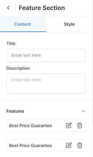
Content Setting: #
The content settings for the Feature section include the following options:
- Title: Set a prominent title for the feature section that captures attention and conveys the section’s purpose.
- Description: Provide a concise overview of what visitors will discover in the Feature Section. Highlight the available tours, their distinctive offerings, and any other important details that would engage the audience.
- Feature: To add features, click the “+” icon. You can include as many features as you’d like. Simply choose an icon, select the icon color, and provide a compelling title and description for each feature.
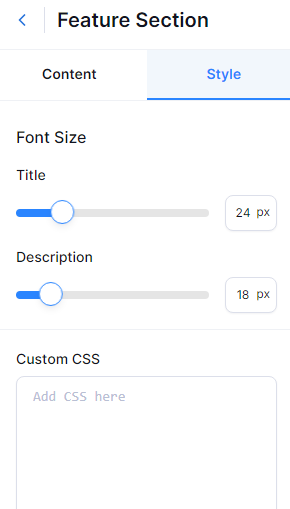
Style Settings #
Below is the list of style settings:
- Title: Set the font size for the title of the section.
- Description: Set the font size for the description of the section.
- Custom CSS: Add custom CSS code to further customize the appearance of the Feature section beyond the provided settings. This allows for advanced styling options.
Destination #
The Destinations section showcases travel destinations that are available in tours plan. The Destination section has two settings: Content and Style.
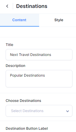
Content Settings: #
- Title: Set a prominent title for the feature section that captures attention and conveys the section’s purpose.
- Description: Provide a concise overview of what visitors will discover in the Destination Section. Highlight the available tours, their distinctive offerings, and any other important details that would engage the audience.
- Choose Destination: Select the destination you want to display in this section.
- Destination Button Label: Enter the label for the button in the destination section.
- Button Label: Provide the label for the button that will display a list of additional destinations.
- Button URL: Input the URL of your Destination Archive page.
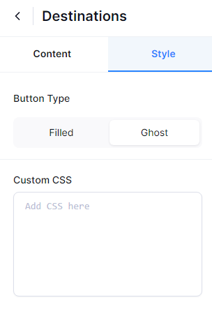
Style Settings #
- Button Type: Choose the style of the button used in the section. You can choose the Filled option to display the button with a background color or the Ghost option to display the button with a border and transparent background.
- Custom CSS: Add custom CSS code to further customize the appearance of the Destination section beyond the provided settings. This allows for advanced styling options.
Activities #
The Activities section outlines various activities available in your tours or services. The Activities section has two settings: Content and Style.
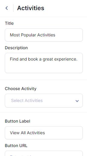
Content Settings #
- Title: Set a prominent title for the feature section that captures attention and conveys the section’s purpose.
- Description: Provide a concise overview of what visitors will discover in the Activities Section. Highlight the available tours, their distinctive offerings, and any other important details that would engage the audience.
- Choose Activities: Select the Activities you want to display in this section.
- Button Label: Provide the label for the button that will display a list of additional Activities.
- Button URL: Input the URL of your Activities Archive page.
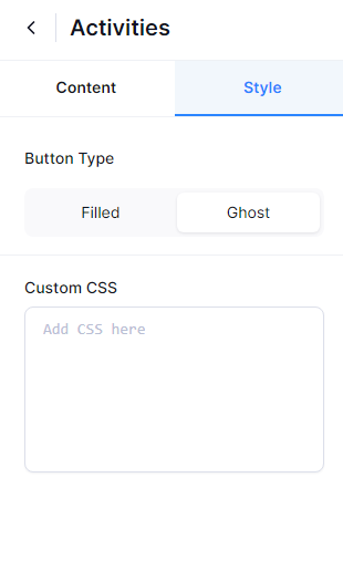
Style Settings #
- Button Type: Choose the style of the button used in the section. You can choose the Filled option to display the button with a background color or the Ghost option to display the button with a border and transparent background.
- Custom CSS: Add custom CSS code to further customize the appearance of the Activities section beyond the provided settings. This allows for advanced styling options.
Call To Action (CTA): #
Call To Action sections are crucial for guiding users toward desired actions, such as signing up for a newsletter, booking a tour, or contacting your business. The CTA section has two settings: Content and Style.
Content Settings: #
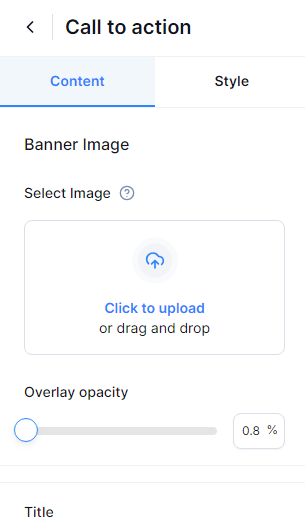
Below is a list of content settings:
- Banner Image: Upload an image to be used as the background for the CTA section.
- Overlay Opacity: Adjust the overlay opacity to ensure the text in the CTA section remains clear and readable.
- Title: Enter the title for the CTA section.
- Description: Provide a short description outlining the purpose of this section.
- Button Label: Specify the label for the button.
- Button URL: Input the URL that the button will link to.
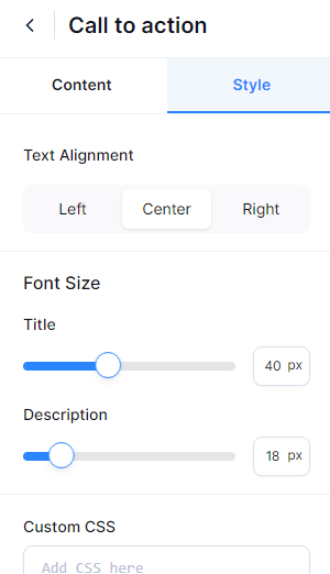
Style Settings #
Below is the list of style settings:
- Text Alignment: Select the position for your content display—right, center, or left.
- Title: Set the font size for the title of the section.
- Description: Set the font size for the description of the section.
- Custom CSS: Add custom CSS code to further customize the appearance of the CTA section beyond the provided settings. This allows for advanced styling options.
Blog #
The Blog section is used to display recent posts, articles, or news updates. The Blog section has two settings: Content and Style.
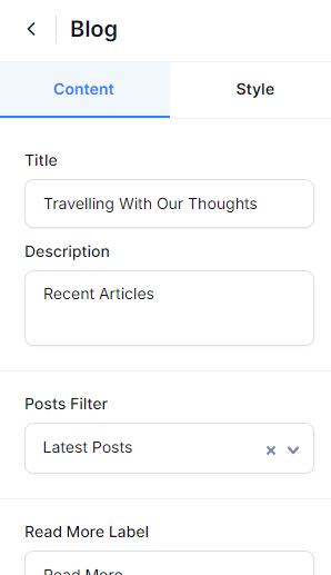
Content Settings #
- Title: Set a prominent title for the Blog section that captures attention and conveys the section’s purpose.
- Description: Provide a concise overview of what visitors will discover in the Blog Section.
- Post Filter: Select the blog filter you want to display in this section.
- Read More Label: Enter the label for the button in the Blog section.
- Button Label: Provide the label for the button that will display a list of additional blog posts.
- Button URL: Input the URL of your blog page.
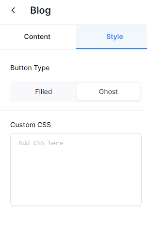
Style Settings #
- Button Type: Choose the style of the button used in the section. You can choose the Filled option to display the button with a background color or the Ghost option to display the button with a border and transparent background.
- Custom CSS: Add custom CSS code to further customize the appearance of the Blog section beyond the provided settings. This allows for advanced styling options.
About #
The About section provides information about your site. You can a description of your site in more detail. The About section has two settings: Content and Style.
Content Settings #
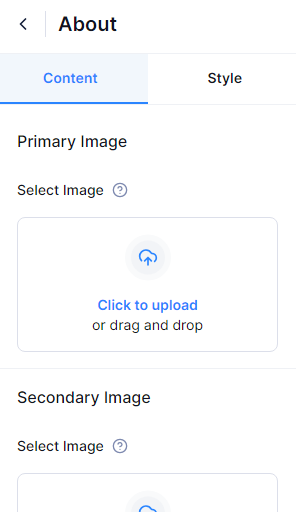
- Primary Image: Upload the main image for the About Section.
- Image: Upload the secondary image for the About Section.
- Title: Enter the title for the section.
- Description: Provide a detailed description of your site.
- Button Label: Specify the label for the button.
- Button URL: Input the URL for your About page.
Style Settings #
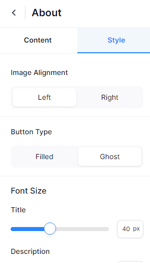
- Image Alignment: Choose whether to display the image on the left or right side.
- Button Type: Select the button style for this section—choose “Filled” for a background color or “Ghost” for a transparent background with a border.
- Title Font Size: Set the font size for the section’s title.
- Description Font Size: Adjust the font size for the section’s description.
- Custom CSS: Add custom CSS code to apply advanced styling and further personalize the appearance of the About section.
Client and Partners #
The Client & Partners section highlights your business partners and client testimonials, which can enhance credibility and showcase professional relationships. The Client and Partners section has two settings: Content and Style.
Content Settings #
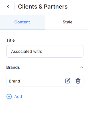
- Title: Enter the title for the section.
- Brand: Click the “+” icon to add a brand. You can upload the brand image, enter the brand name, and provide the brand’s URL. Add as many brands as you’d like by clicking the “+” icon.
Style Settings #
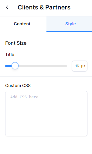
- Title: Set the font size of the title.
- Custom CSS: Add custom CSS code to apply advanced styling and further personalize the appearance of the Client and Partner section.
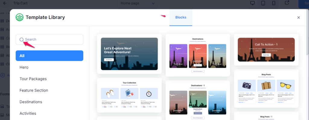
Add Pre-designed block #
You can select a pre-designed block and customize it to fit your needs. Simply search for the desired block design, click on it, and edit as needed.